|
Getting your Trinity Audio player ready...
|
When to use what type of colour separation when custom printing t-shirts.
Printing onto T-shirts via the old school screen printing method is not always simple and straightforward. The process to make the decision involves variables that determine the approach you take when it comes to custom printing clothes such as t-shirts. So, before you decide what process you want to use, you need to know about the variables:
The first variable in the list is the picture itself and the way it will get separated before it is sent to the screen room. The artwork or design you create is made with fundamental variable building blocks that are the reason why you have to consider how you will screen print your design:
- Is it a bitmap or a vector file format?
- Is the resolution of your design or artwork good enough to start the process with?
- Your artwork will have either one or more than one colour. Decide how many colours are too many?
The ‘object’ in the design, artwork, or logo may contain gradients, tonal changes, or solid spot colours. The artwork can have text too. So, the size of the artwork is crucial to the process. Similarly, the thickness of the key lines, if your design has any, is important to be considered as well.
- What colour garments or fabric are you printing your artwork on?
Many customers, however, will not take into consideration that so many factors are required when assessing artwork and designs. If they end up getting a graphic designer to produce their design or artwork who is t-shirt trained, then the graphic designer will consider all the above-stated factors because of his/her prior knowledge and expertise in the field.
Screen printers are usually given very low-resolution and low-quality pictures and designs downloaded directly from websites for production. These images are, however, not sufficient for direct reproduction because web graphics are designed to be a size as small of a file size as possible. The reason for this is that this way, the web page, the images are lifted from, has a faster loading speed.
Such images are then more than often have to re-drawn with the help of a vector program, for example, Adobe Illustrator or similar software. Or they are exposed to a number of Photoshop filters in order to try to enhance them, or sometimes both.
Assuming your design or artwork is the best it can be, there are several colour separation techniques that you can use:
Spot Colour Separations
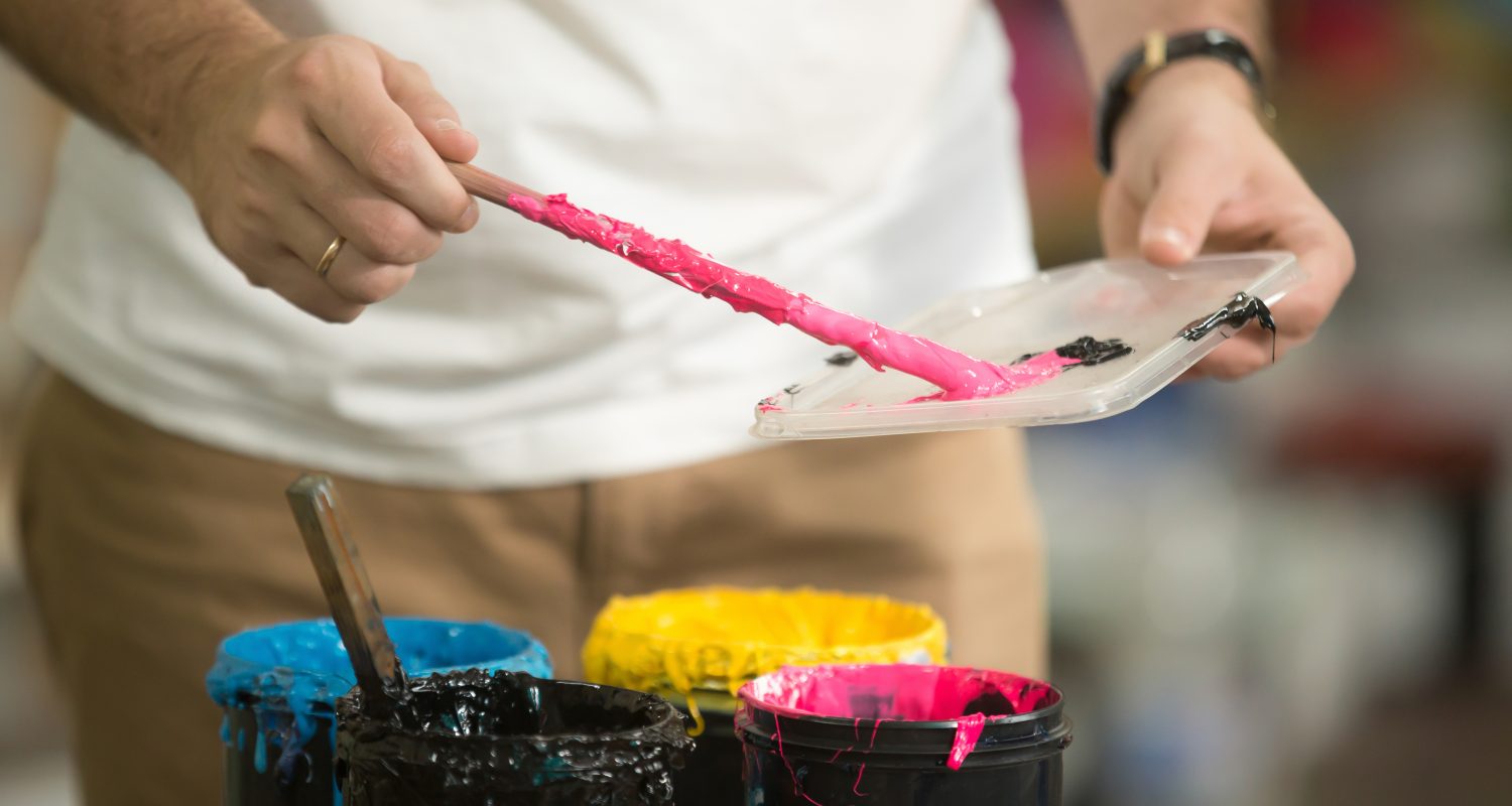
Spot colour separation is the most often used and the most basic method of colour separation. It is used when the artwork is made using solid colours that do not have intricate photo-realistic colour variations or tonal variations also referred to as gradients. You can do these with software such as Adobe Illustrator or Adobe Photoshop. The idea behind this is that every colour is lifted from the artwork, placed into its own separate layer within the layer palette of the adobe program that you have used, converted into a black infill, and then finally labelled with the registration marks and colour information before they get printed onto acetate film or for the screen room. The best part is that every colour fits snugly and perfectly next to the other colours you have used with no overlap.
Process Colour Separations
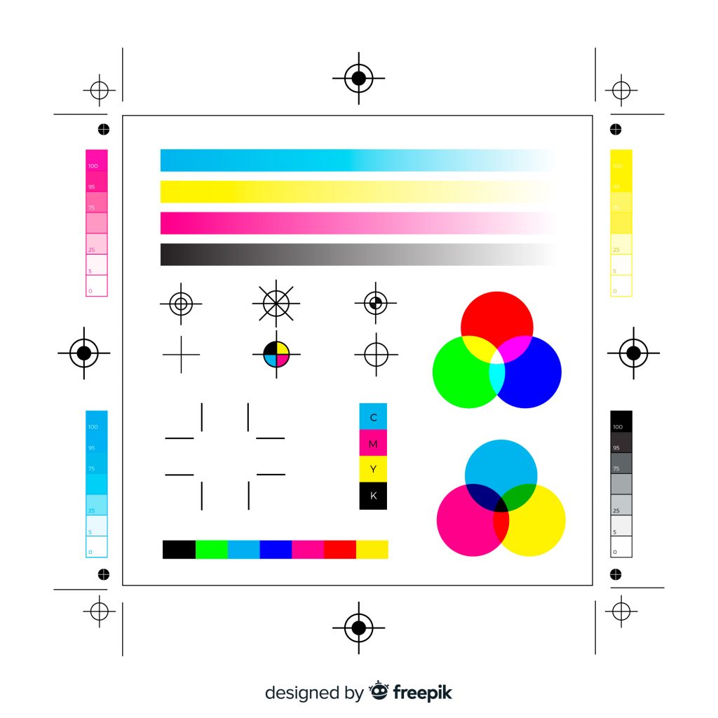
This type of printing requires four colours to make multi-coloured designs with hundreds of colours. Process printing is usually referred to as CMYK printing with the letters representing Cyan, Magenta, Yellow and Key. All the pictures that you see in magazines are printed using this type of printing, and you can even see a variable pattern of small dots if you hold a magnifying glass up to these pictures.
The resolutions that are achieved using modern digital paper printing presses are much better than the resolution achieved using screen printing. Plus, these dots are also difficult to spot with the naked eye in a magazine, however, they can be easily seen on a t-shirt. The reason for this is that the output resolution to the film needed to burn a screen can’t be more than 65 dpi or LPI. This depends on the restrictive capabilities of the processes and chemicals employed in screen making for screen printing.
Process separations work incredibly well with white T-shirts, but they do not do well with dark t-shirts. The reason for this is that the process inks used for this procedure are a little transparent and the colour of a shirt that is darker will show through the ink printed on it and will affect the print colour. You can also try printing a white base under process inks, but you may get a ‘washed out’ colour effect as a result, which will prevent your final image from looking the way you want it to. You can also augment process printing via spot colour printed in a halftone, so it can fit in the dot configuration of the process separations. Furthermore, you can never get Pantone accurate colours by using process printing. Plus, the majority of the skills in making a good print depend on the printer who is responsible for setting the job up, on the press along with good separations delivered by the artwork department.
These separations are printed on a high mesh count screen. The screen is designed specially to hold detail. Typically, mesh counts of 90 holes per inch up to 140 holes per inch are preferred for this.
Simulated Process Printing
This process uses spot colours output to halftones similar to how the CMYK halftones are rendered.
This is considered a better option than CMYK separations for complex, tonally rich t-shirt printed graphics as it produces bright, vivid colours regardless of the t-shirt colour. A white under-base is required along with experience and skills to understand the process and separate correctly. Photorealistic images can be achieved with this process which can sometimes be called ‘channel’ or ‘tonal’ separations.
These separations are printed on high mesh count screens that are designed to hold detail. Mesh counts of 90 holes per inch up to 140 holes per inch are typically used.
Index Colour Separations
These are also known as diffusion, dither, or stochastic. This type of method uses tiny randomly spaced squares instead of ellipses or dots to make the tonal variations. The small squares are printed next to one another instead of overlapping like simulated or process, process printing. As a result, you get a ‘jigsaw’ effect which results in tonal variations.
If you look at it closely, you can spot that the image has a ‘posterised’ look which cannot be seen if you move away. The human eye cannot usually detect this effect and, so the image appears tonal and variable.
When To Use What Spot Colour Separation? (Conclusion)
Spot colour separations vary depending on the design since the majority of artworks are solid coloured images or consist of simple text. When you are working with a variable and tonally rich design, then you will have to go with simulated process printing. The only limitations to this method are budgetary.
If you have a budget that lets you use only 4 colours, and you are working with white t-shirts, then CMYK is your best fit.
If the design you are working with is tonally variable but also has a ‘high contrast’ effect requirement, then you may have to go with INDEX.